I felt like I tested a lot with various different materials when creating my backgrounds. I understood what environment I wanted to mold and I had three words that re-directed me if I was drifting which were cold, icy and snowy. This technique really helped transform the sea into something with depth.
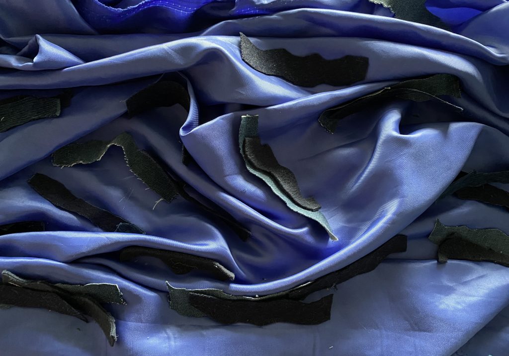
I began in the real world, grabbing random pieces in my room, in the world around me and spare materials and fabrics in M301. I used photography from the Arctic as a guide but I was more trusting my gut and seeing what colours looked satisfying together and complimented the foam blocks that were used to immitate Ice blocks. It was a lot of gluing and cutting and ripping, at some point I got lost in my own little world and whilst I didnt end up using thsi in my end piece, I learnt so much in reagrds to the limitations of certain fabric but equally how flexible so many materials can be when creating an environment.
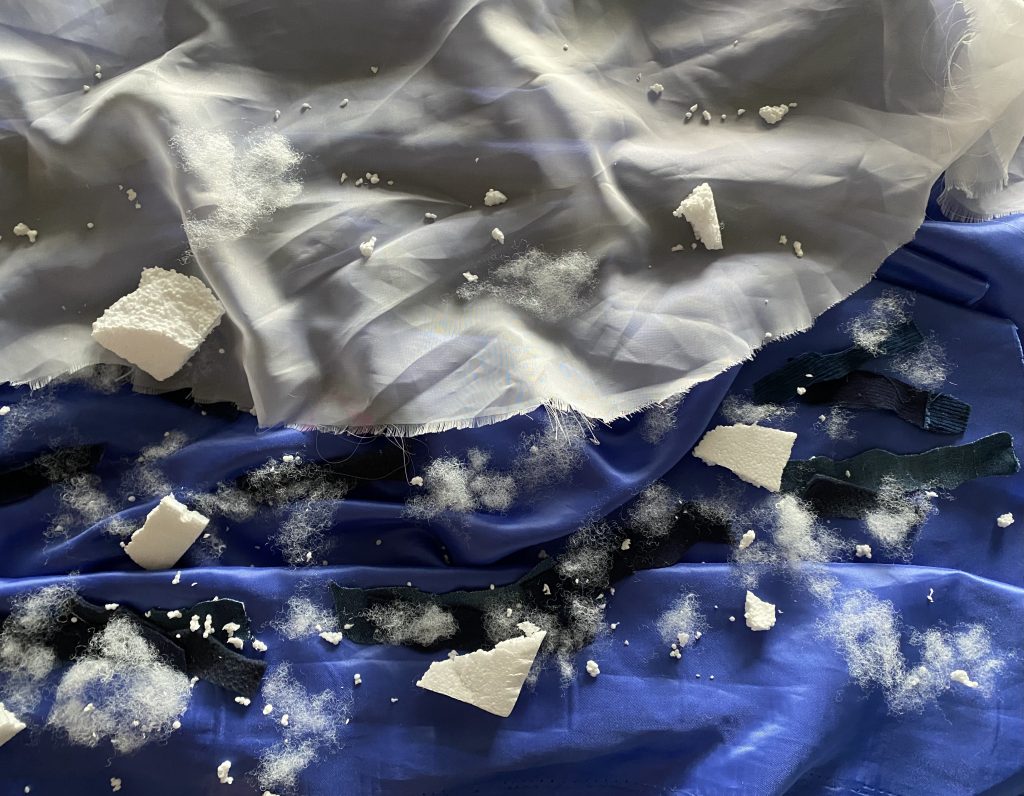
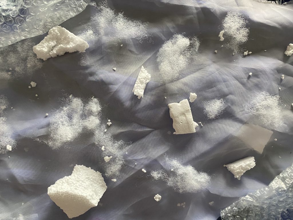
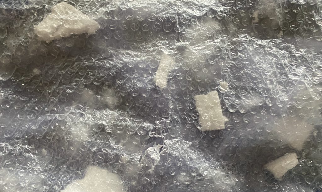
I kept working in the real world and at some point during this time period, my pillow ripped and the stuffing came out and I began to realise it looked oddly like snow. I began layering the stuffing over my fluffy white blanket and scanned it through my phone before adding a blue overlay in after effects. I loved the results, but the previous raw materials were not what I had in mind and so I took to procreate and began to design a digtal background for the sea and ice, with the reasurrance that my first background was now complete.

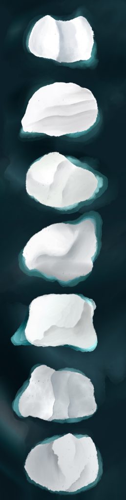
Using a drone image of the arctic sea, I began to work on my backgrounds, using a range of different textured brushes and trying to highlight the water with a turquoise shadow as it complimented the snow well. I then realised I would need to create three backgrounds in order to make them move in after effects.
This ended up being more challenging than I thought it was going to be as I had to make sure each background would blend perfectly, trying not to throw any new colours and keep to a strict set of rules for every background.


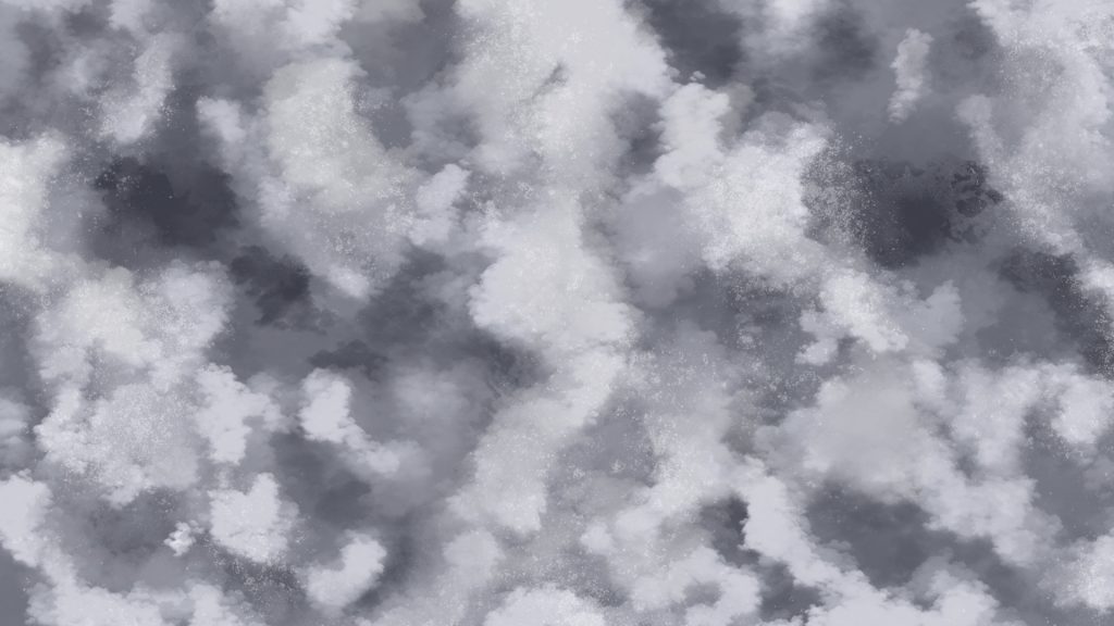
Once I had my backgrounds complete, I created a quick digital overlay to make sure that my title page and ending credits page would have some movement. This meant keeping to the same colour theme and playing with a range of bruhses to create a ‘mess’ of colour tones.
Leave a Reply